How micro-moments shape the user’s perception of software age
Users judge software systems through short, sequential micro-actions: clicking a button, waiting for a confirmation message, reading an error description, or navigating a search results drop-down. If these moments feel fluid, predictable, and clear, the operator describes the entire tool as modern and efficient.
Conversely, if an interface leaves the user wondering whether their action registered, the app feels old, even if it runs on a brand-new cloud framework. Perception is the only reality that matters for user retention metrics. Prioritizing the design of these touchpoints allows companies to fix user friction without spending capital on backend refactoring projects.
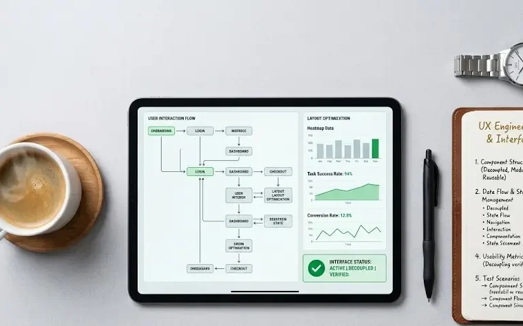
Optimizing information hierarchy to reduce employee cognitive fatigue
Over years of continuous development, adding features slowly deforms the visual order of software interfaces, overwhelming workers with too many fields, buttons, and blocks on a single screen. This visual noise forces employees to make hundreds of small choices regarding where to look next, triggering acute cognitive fatigue.
Product engineering teams resolve this layout strain by implementing progressive disclosure rules, presenting advanced settings only when they are needed for the specific step of a process. Consider these basic layout updates:
- Collapsible data menus that hide non-essential background details.
- Consistent button placements across all administrative views.
- Increased visual contrast between primary actions and secondary navigation links.
Streamlining the visual interface protects the worker’s attention, reducing data entry errors and accelerating processing speeds throughout the business day.
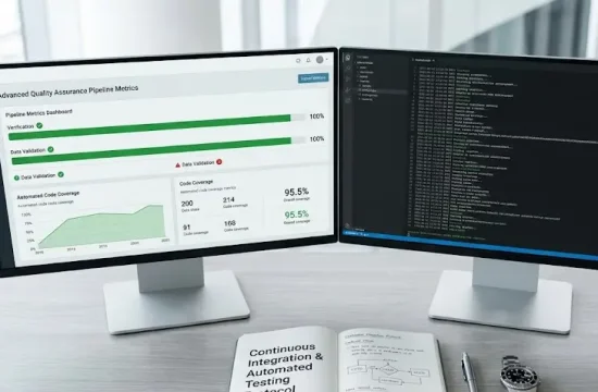
The role of instantaneous feedback loops in mitigating perceived latency
Backend database constraints often trigger real processing delays that engineering teams cannot fix without a massive, multi-year architecture redesign. However, interface developers can change how users experience this wait time by deploying responsive feedback animations and clear progress indicators.
A static screen during a save action causes users to click repeatedly, creating double entries and system strain. Introducing skeleton screens, discrete loading bars, and instant button-state changes removes uncertainty from the interaction loop. Instant visual validation keeps the operator calm and engaged. An interface that communicates what the system is doing feels faster than a raw terminal that remains silent until the server processes the data query completely.
Implementing smart defaults to accelerate repetitive data entry tasks
Long data entry forms are a persistent source of friction that slows down daily corporate tasks and introduces human errors into central databases. The product engineer’s toolkit addresses this issue by introducing smart input defaults based on local user profiles, historical patterns, and regional data parameters.
Pre-filling repetitive fields, using inline auto-complete functions, and minimizing required text fields cuts the time needed to complete a workflow. Smart default inputs save hours of administrative effort across departments. This optimization allows the workforce to focus on exception handling and deeper analysis, boosting the utility value of every active user seat.
Balancing frontend design iteration with core system infrastructure safety
Capturing the full returns of surface modernization requires a clear balance between fast frontend design changes and core infrastructure safety. Organizations must separate the client-facing presentation layer from the central transactional engine using stable, decoupled API adapters. This ensures that design teams can iterate on interfaces based on direct feedback without risking database downtime.
Before launching a redesign campaign, it is smart to analyze the frameworks used by teams that specialize in improving software design on complex systems to ensure smooth data synchronization. Securing this structural boundary allows companies to protect their core software investments, extend platform longevity, and match modern design demands on a predictable, highly controlled development budget.